01
The New York Times x Google Cloud
I worked with a small team to create an immersive AR and web experience that showcases the power of Google Cloud and highlights their unique partnership with The New York Times. Visit the experience.
Together with Google Cloud, The New York Times is digitizing the “morgue” and creating a custom software solution that will give journalists access to explore it in a whole new way.
Intro —
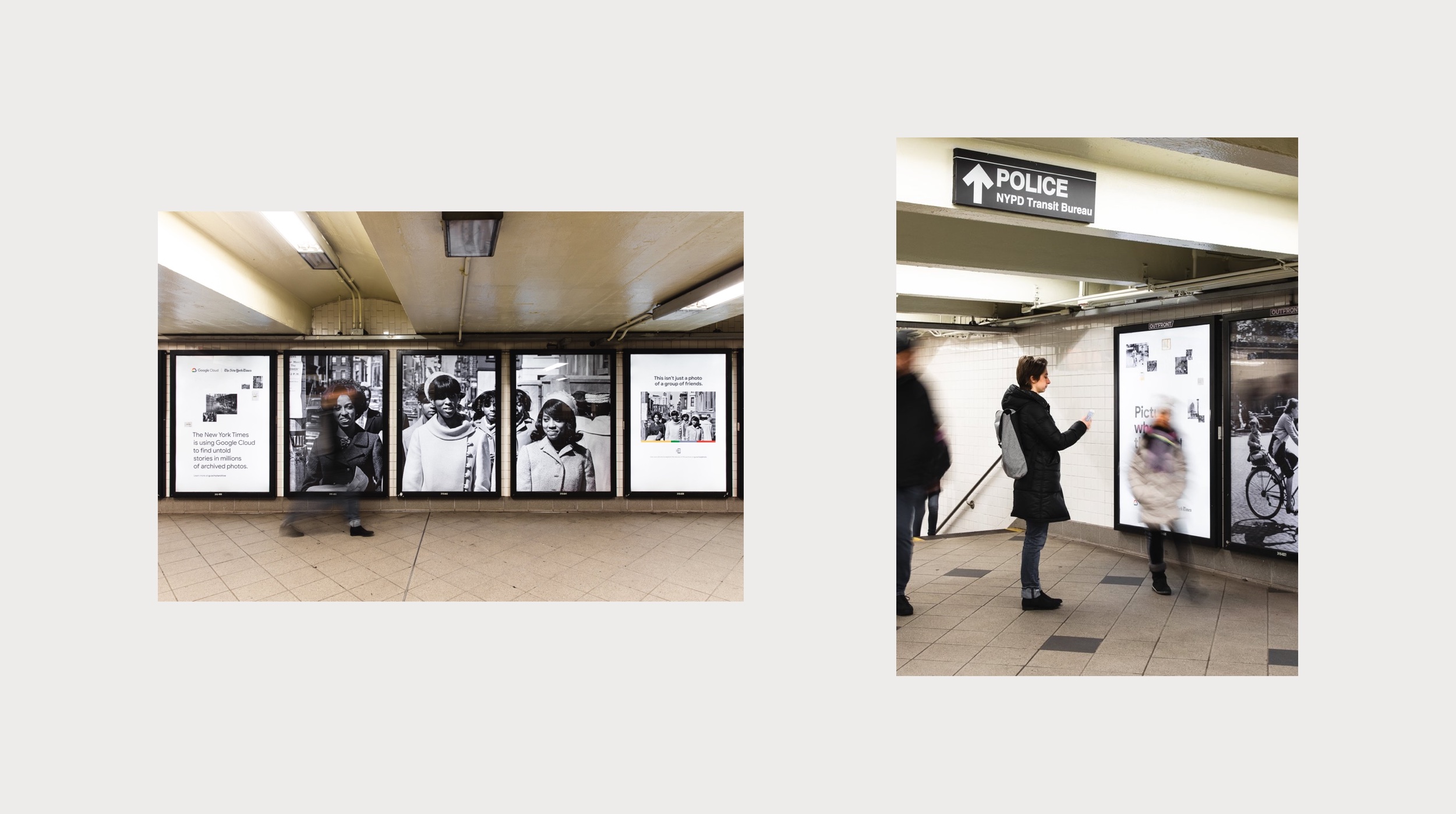
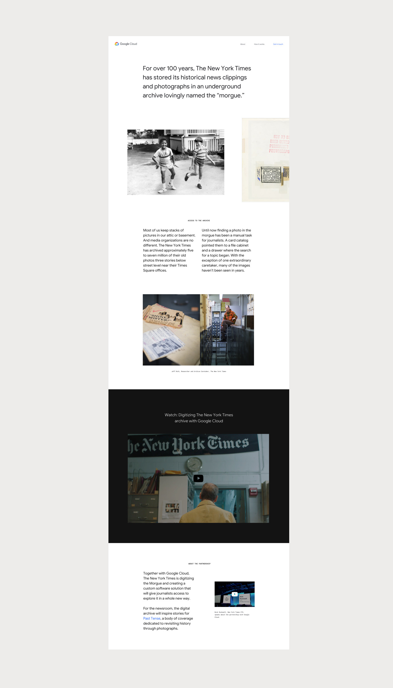
For over 100 years, The New York Times has stored its historical news clippings and photographs in an underground archive lovingly named the “morgue.” As one can imagine, filing millions of photos, especially ones that are rich with historical subject matter, gets a bit tricky. Google Cloud teamed up with the New York Times to build them a custom tool using the power of the Cloud to not only digitize but organize these photos so that they are searchable by the journalists looking for them.
Our team was tasked with showcasing this powerful tool and highlighting the partnership between Google Cloud and The New York Times. The campaign and experience launched November 2018, with ads running in the The New York Times and posters lining the walls of NYC Subway stations.
A
Campaign Video
Build from white black.
Brand —
B
Image Treatment
Color Palette
000000
FFFFFF
B8B8B8
4285F4
F1F3F4
For this project, we faced a unique challenge when it came to how the brands would be represented. Our client was Google, but it was important to their team and The New York Times that the project was represented as an equal partnership.
Google’s mantra, when it comes to design, is “build from white.” This philosophy not only means that Google designers should be very intentional and selective when using color, but also, to give the design enough room to breath. Build from white[space]. On the other hand, The New York Times is over a century old; its bold, black, and has a distinctive logotype. The Time’s purpose, at its core, is to inform readers with the news. This means each centimeter of precious newsprint is carefully planned to deliver the most to its readers.
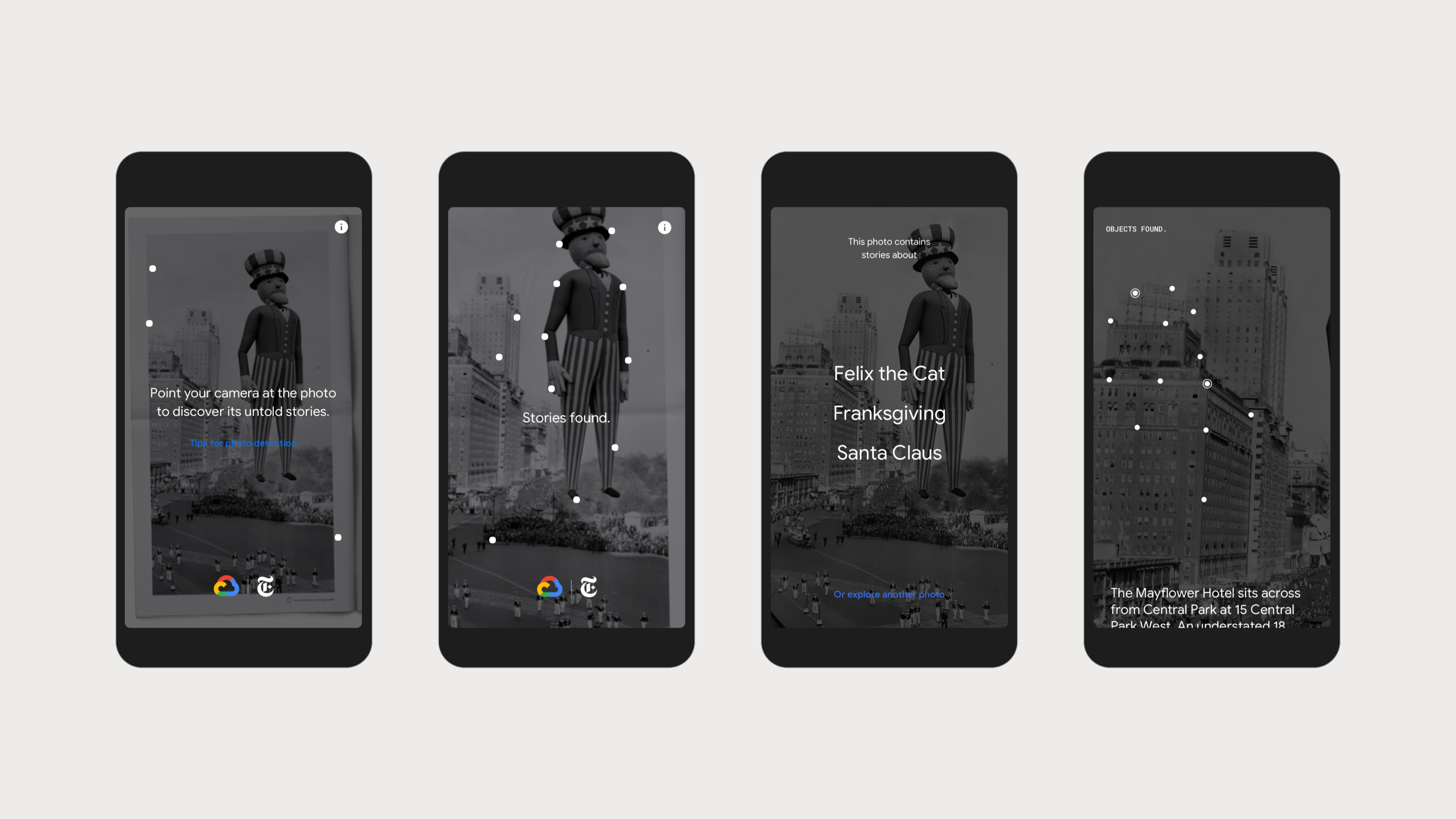
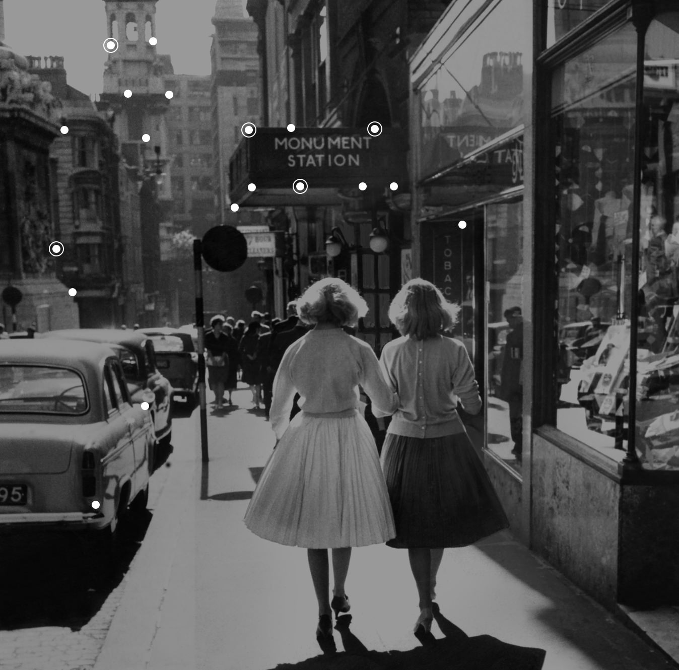
The brand for the project utilized a reduced pallet of Google colors, and maintained the brand fonts: Google Sans and Roboto Mono. The archived photographs take center stage, living primarily in a black background, where supporting colorful imagery supports the hero image. It is imporant the product remains at the focus of the experience and is seen in key moments when the dot particles appear and analyze the imagery.
Design elements
Google Sans

C
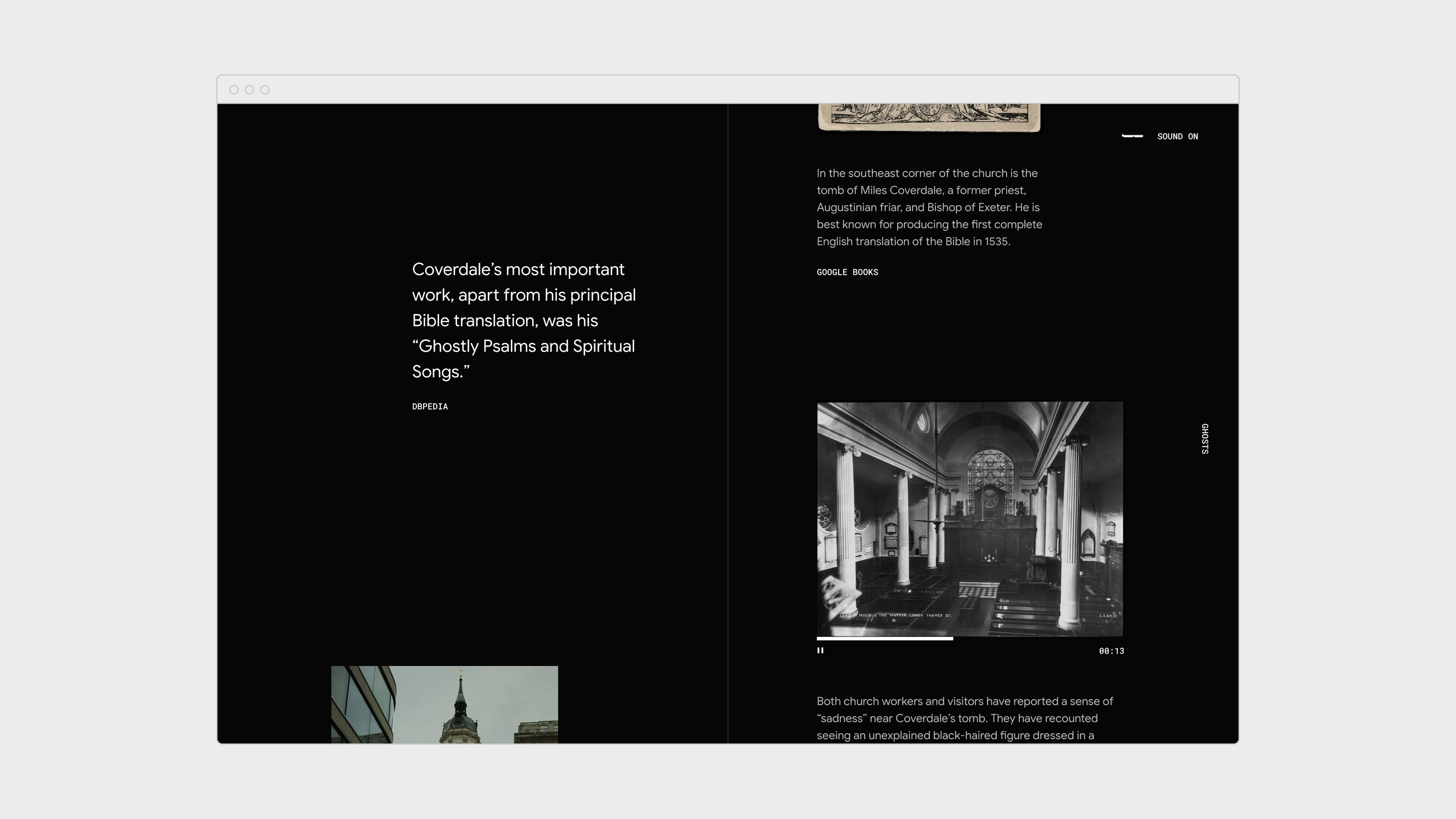
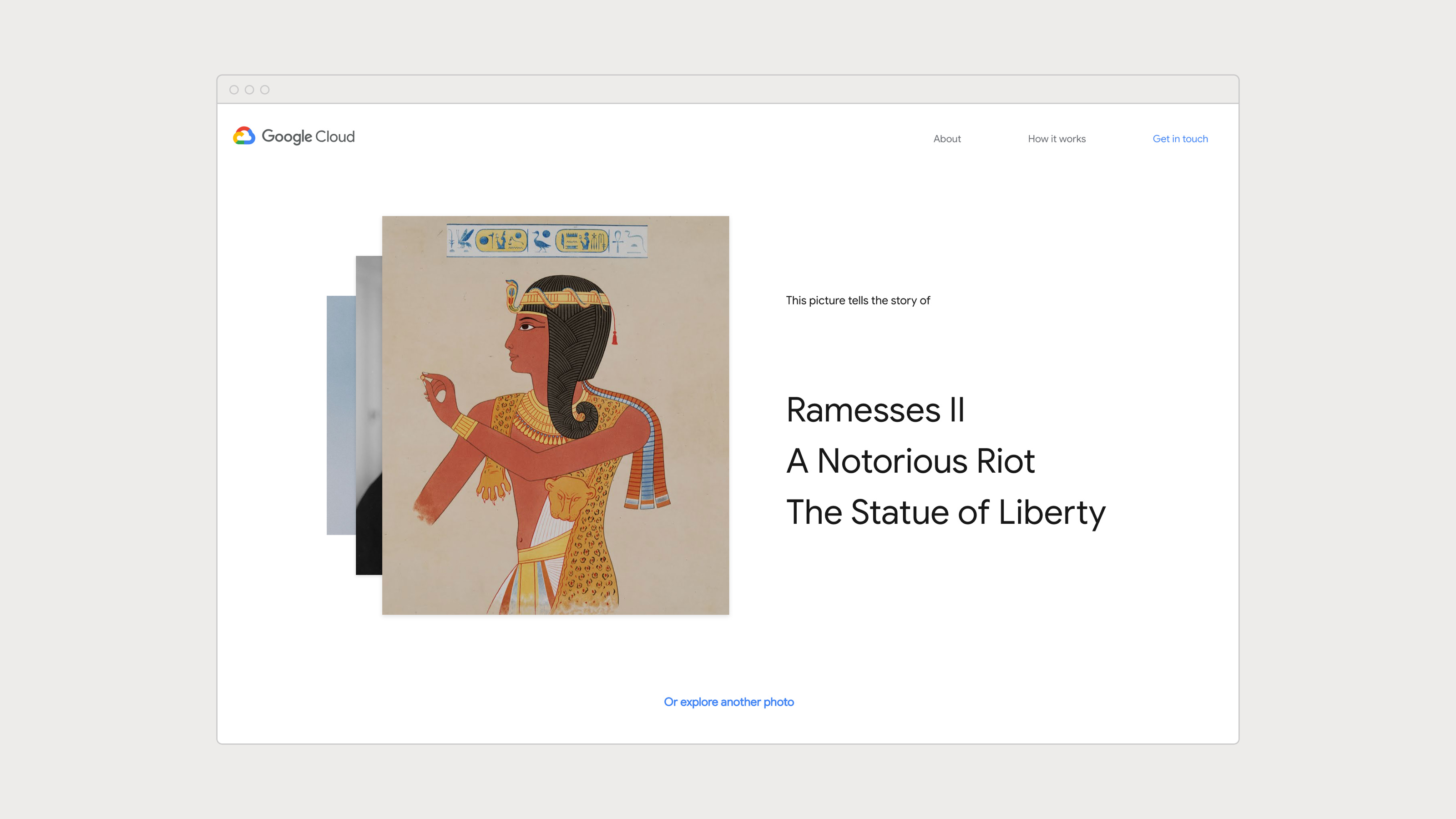
Story Page

D
About Page
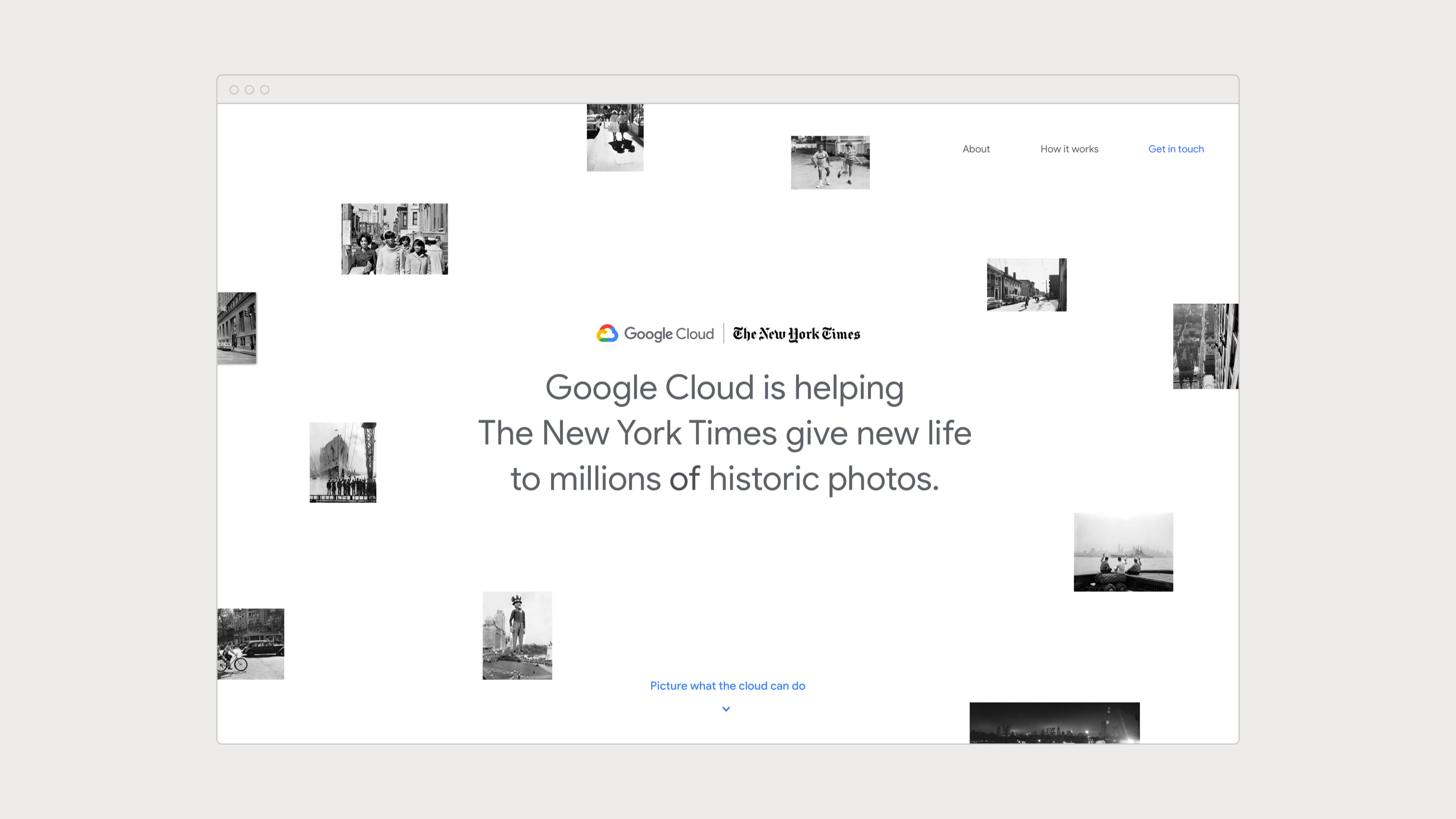
Digital experience —
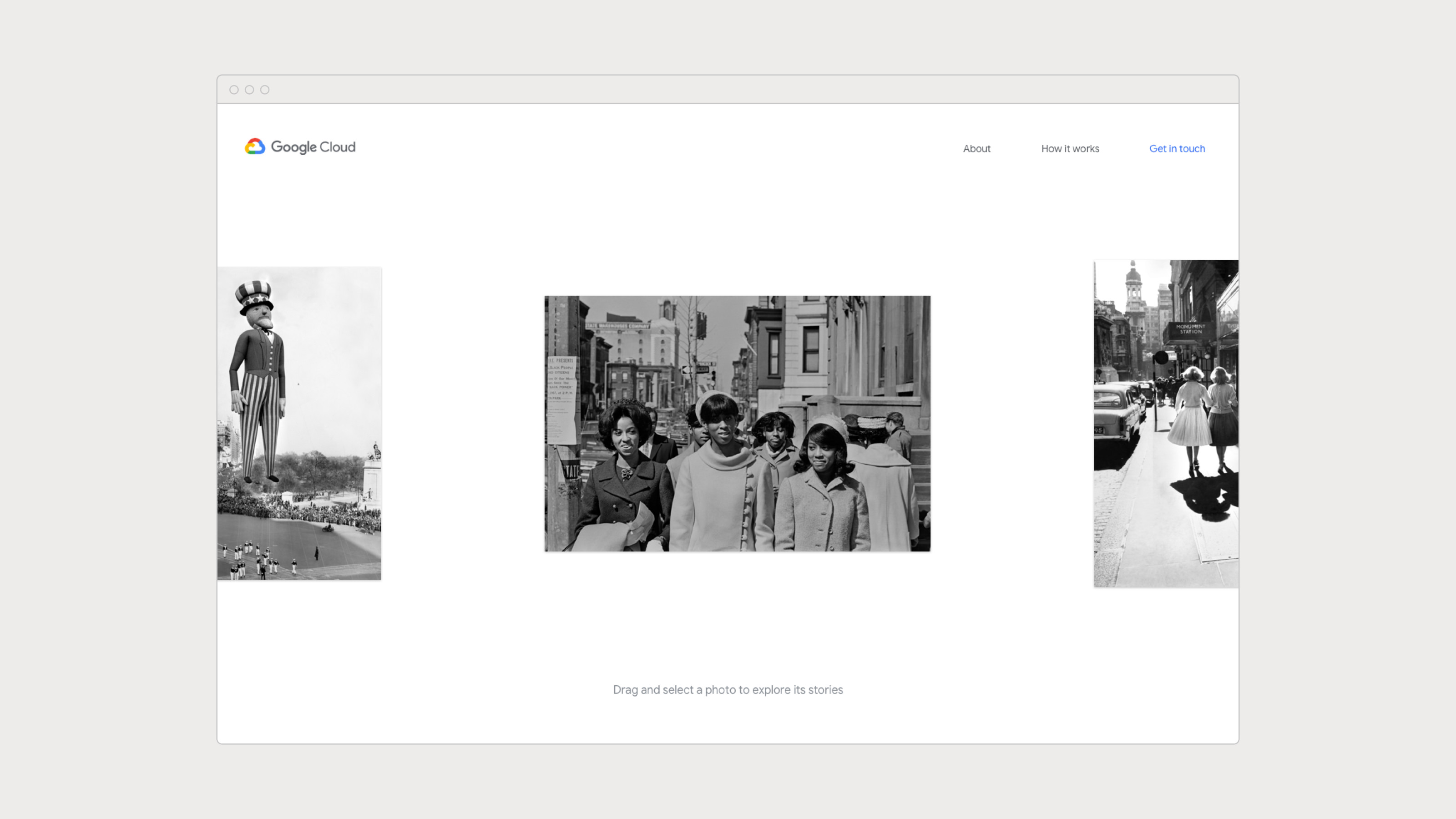
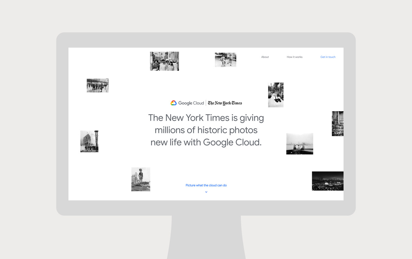
The user enters the experience one of two ways: through the AR experience or directly to the home page. Newspaper and out-of-home ads prompt the viewer to “Picture what the Cloud can do.” The user follows the link and is prompted to hold up their phone to the ad. Particles search and lock in on the subject, identifying the photograph. Once the photo is identified the user can start exploring stories. To initally bypass the AR experience and explore all the NYT photographs, visit the website here.
The web experience serves as a marketing piece that promotes the partnership and power of Google Cloud. The user can learn more about the project and the tool by exploring “About” and “How it works.”
Interactive Experience
1 / 6
Previous — Next