01
Skön Skincare
This project was a result of a week-long challenge given to me during an interview process for a digital brand and experience agency. The challenge was to design a brand and landing page of a made up skincare brand. Long story short: they offered me the job.
"A Scandinavian based start-up is launching a personalized skincare brand, offering bespoke skincare products made for individuals’ own skin condition. They need help with developing a new brand to enter the crowded skincare market."
Brief —
The objective with the assignment is to develop an identity for the brand and a purposeful yet inspiring online experience. In order to fulfill the assignment, I had to come up with a name for the brand. The actual name was not be part of the evaluation, but necessary for the identity. The requirement was to create a visual identity and example of a landing page and the following were a list on inputs to consider when designing:
– The brand’s target group is men and women aged 25-35 yrs
– The brand should convey premium-ness but at the same time feel attainable for everyone in the age group
– Point of purchase will be on their website and app
A
Lockup
B
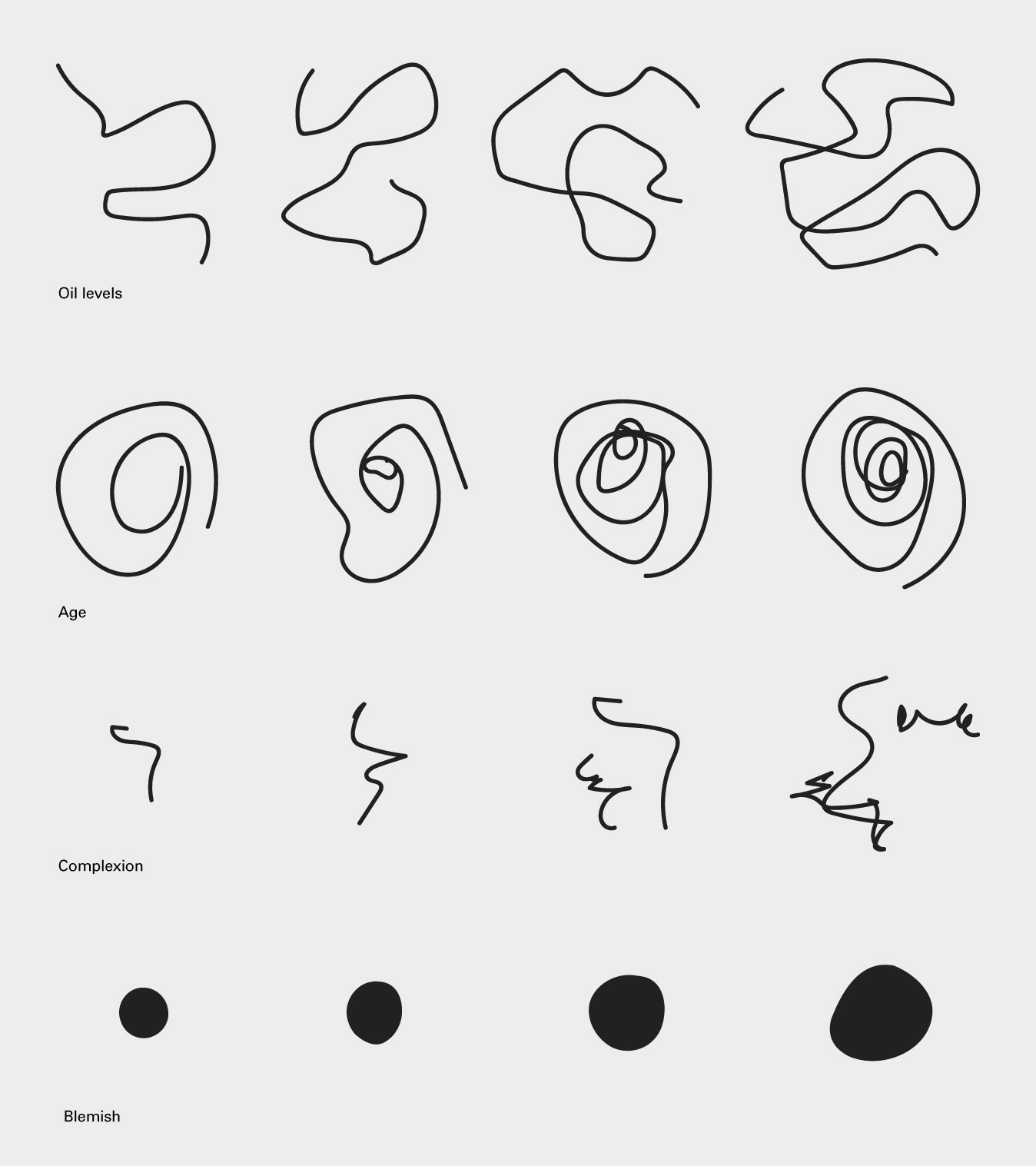
Illustration style

skön, translated to english, means beautiful and comfortable.
Brand —
C
Kit of Parts
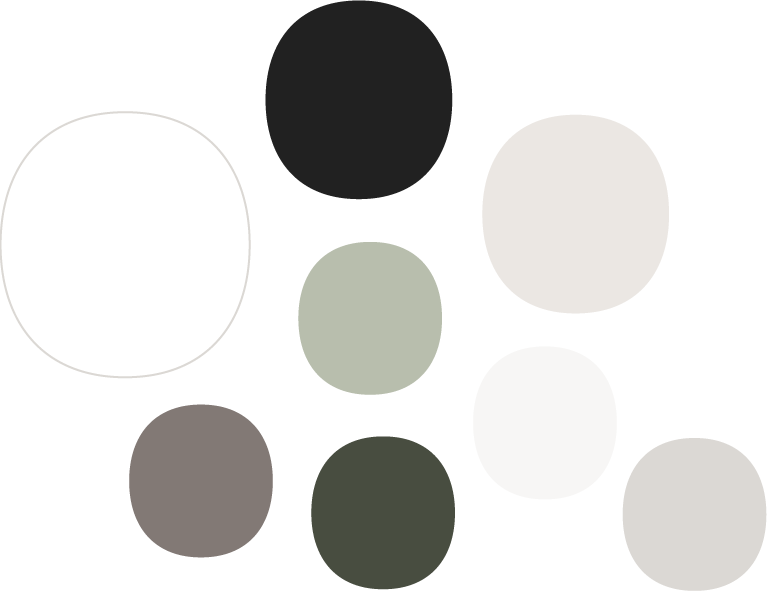
Color Palette
skön is modern skincare designed for the individual. We all strive for beautiful skin, but the truth is, we don’t all have the same skin. skön curates natural ingredients to balance your complexion and nurture healthier skin over time.
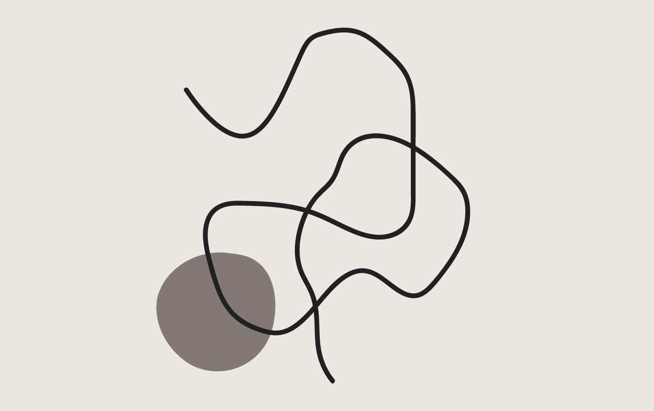
skön’s brand, like the product, is customized for you. skön believes your skin is unique and beautiful, a piece of artwork that is one-of-a-kind.
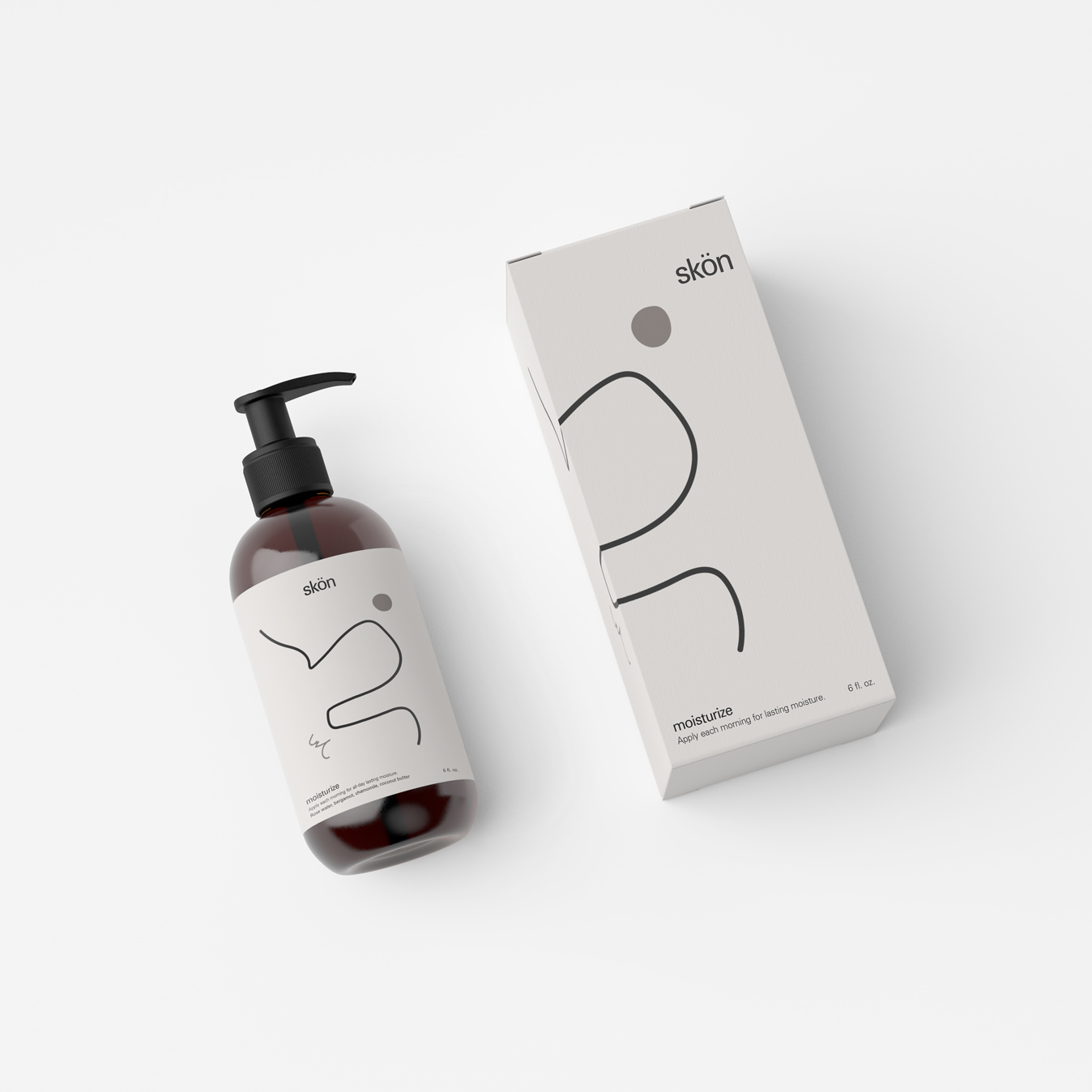
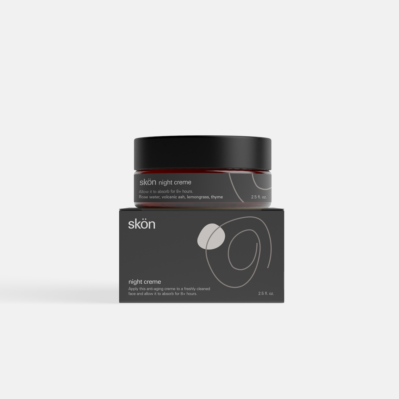
The brand artwork is made up of simple illustrative drawings that can be programmatically designed to create unique artwork. This illustrative style is then paired with natural and dramatic imagery, embracing chiaroscuro and the way we experience skin in real life. Univers is used as the primary typeface. It is neutral in style and form and does not compete with the artful expression of the brand. It is paired with Beaufort, as a display style, on the website.
Logo redlines
Univers

Beaufort

D
Bottle Packaging
E
Creme Packaging
Digital experience —
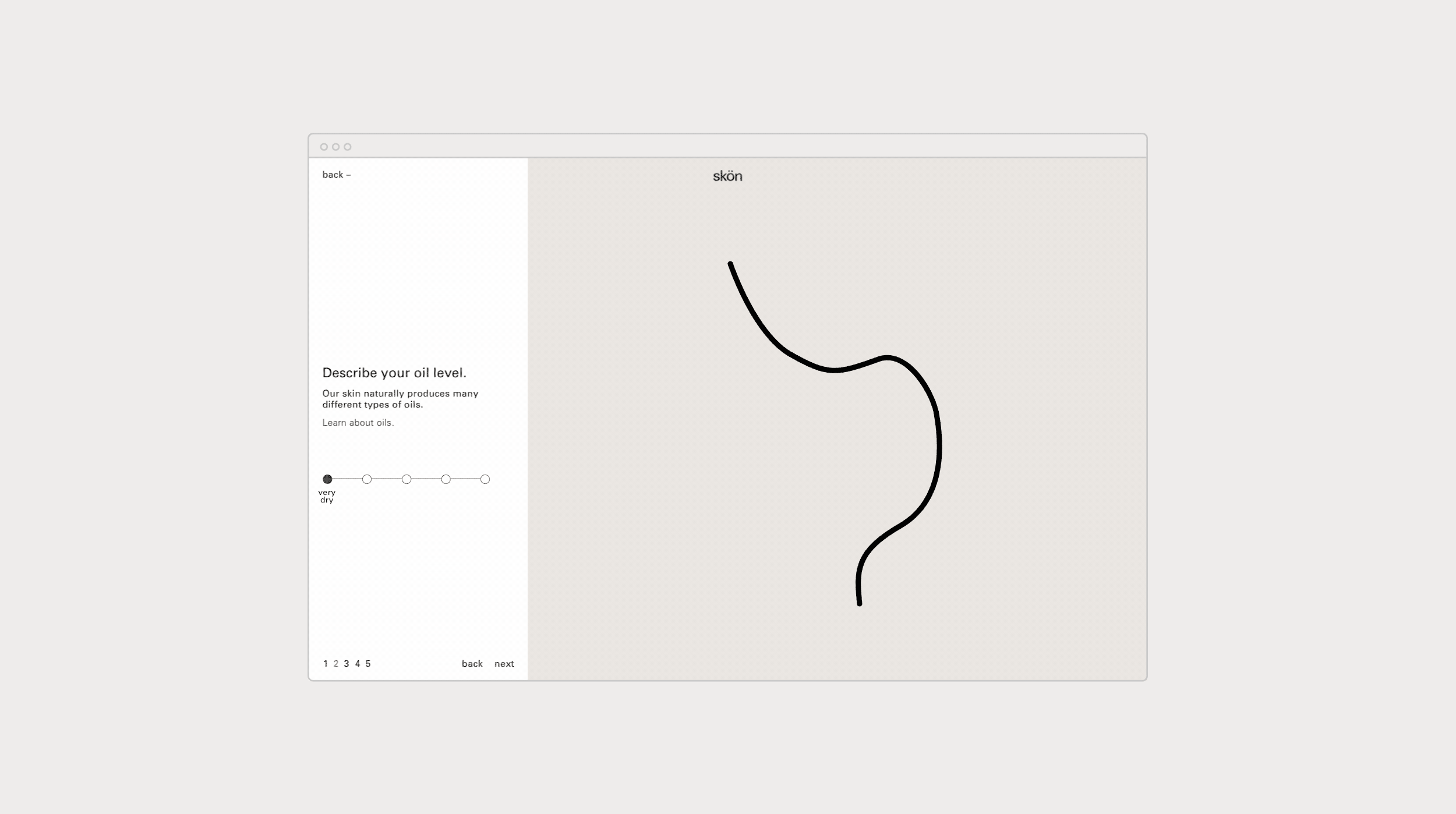
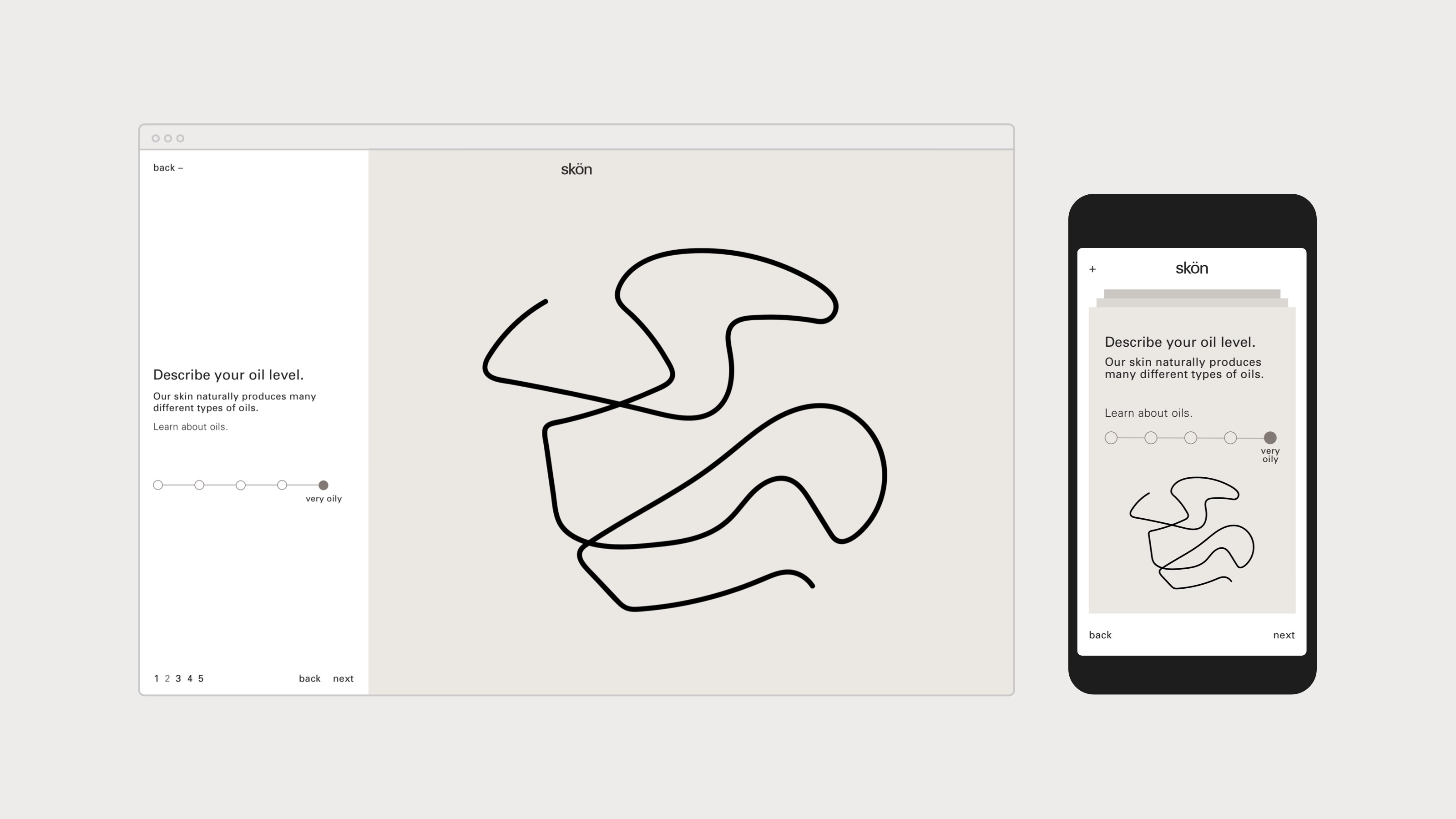
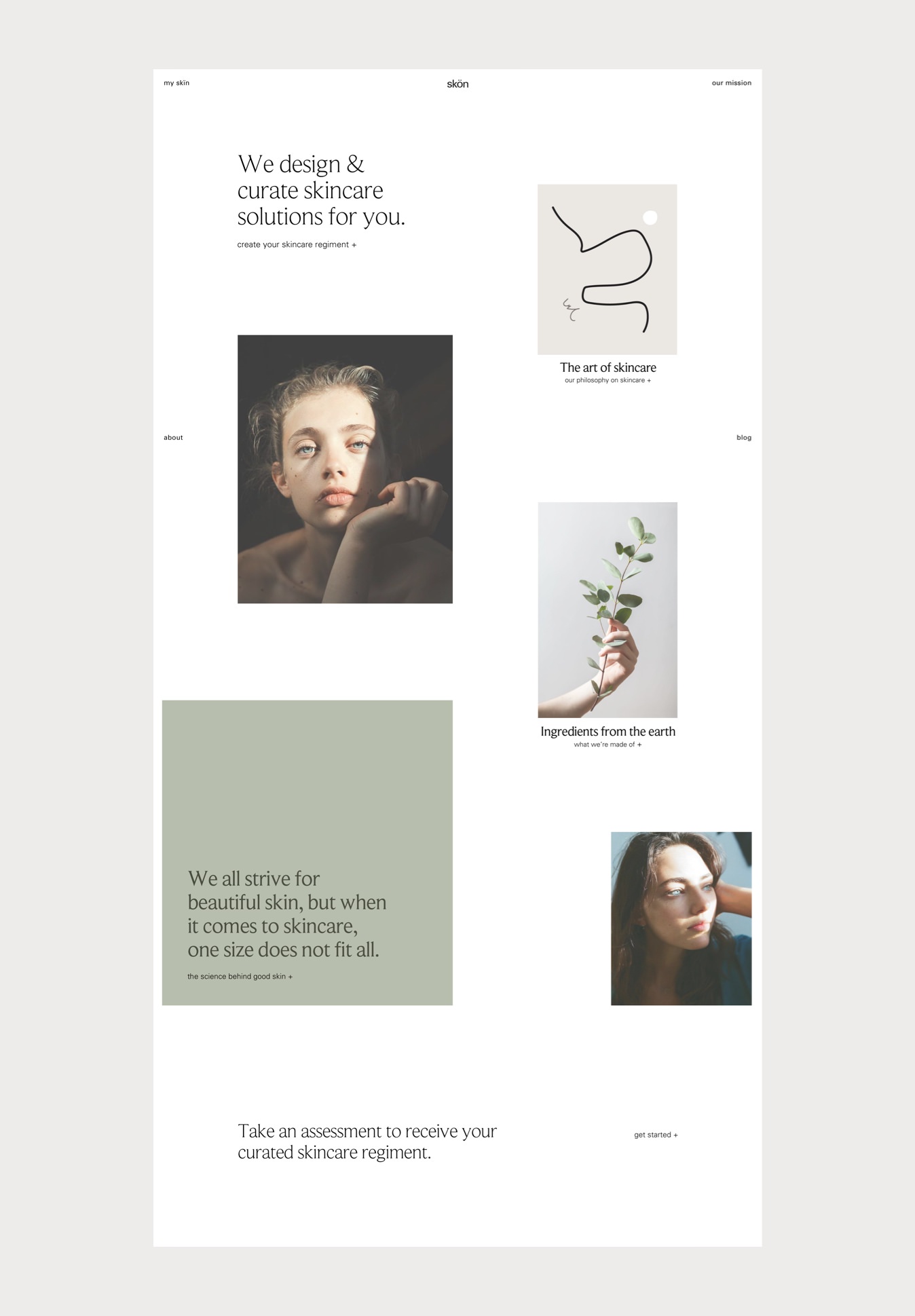
The primary purpose of the website is to guide the user to create their skincare regiment and purchase the products. The user follows several easy and engaging steps to design their personalized skincare regiment. As they work through each section, the visualizations are recorded and the artwork is later applied to the products.
The website isn’t your typical product-centric experience. Instead this space serves as a gallery to highlight the the user, the ingredients, and the philosophy of skön. Photography and bold color blocks add visual variety. The UI remains simple and text-based letting the content take center stage.
F
Desktop
G
Mobile
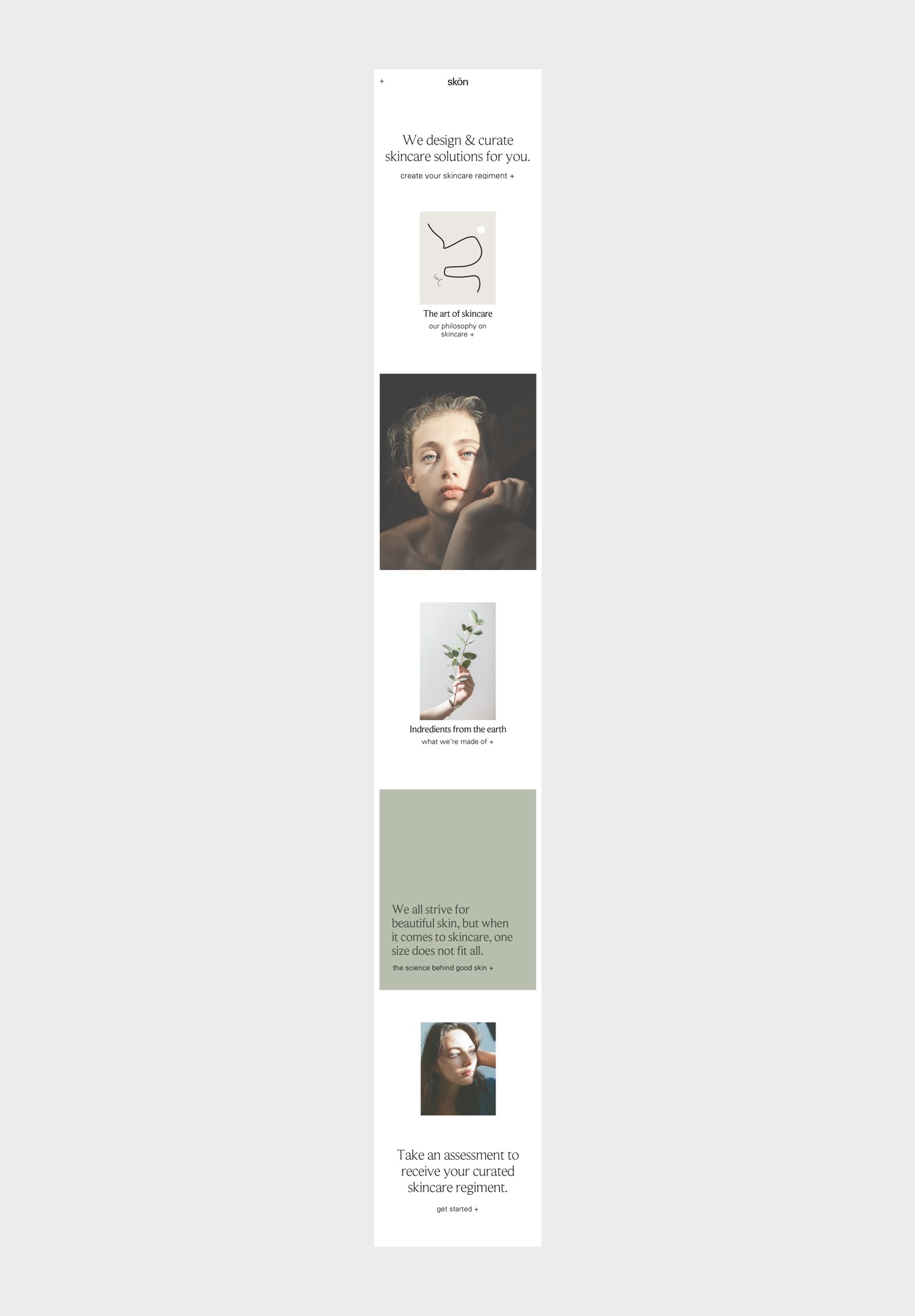
Website
1 / 3
Previous — Next